Can you describe your subject?
Picture books for adults, I suppose.
Not graphic novels?
Well none of these is a graphic novel. You could say they’re all comics. That’s what I’d say, but in fact only Chris Ware’s one is a comic in the ordinary sense. Graphic novels can be great, of course, but I prefer something a bit more unusual most of the time. The titles I’ve chosen are the types of books that interest me: cartoon books, picture books for adults.
Why would adults read picture books?
People tend to think that when you’re an adult you don’t need pictures any more to enjoy a story. But it’s not as though when we’re adults we give up TV and only listen to radio. The relationship between words and pictures is an interesting relationship. A bad picture book obviously just repeats the pictures in words – ‘This is an apple’ – but a good one uses each medium to complement or sophisticate the other: ‘This is not a pipe’. And the more you read picture books, the better you get at reading them, the more you can get out of them. Interestingly, when I’m tired I tend only to read the words in a comic, instead of taking the time to slow down and look at the pictures.
What’s your first book?
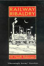
The Heath Robinson railway book. I chose these titles chronologically, according to when I read them in my life. It wasn’t a book when I first saw it, it was a calendar my dad had, who was an architect. It’d been given to him by some kind of building supplier and I was fascinated by it. I was always fascinated by my dad and his drawings for work – buildings, technical drawings. I loved all the fancy drawing tools he had that I didn’t have: Rotring pens and tracing paper and a photocopier and razor blades. I always wanted him to bring me home tracing paper so I could copy pictures out of comics, and he would refuse and insist on my drawing them by eye. But there’s a magic to tracing paper.
Heath Robinson fascinated you because of the technical angle of the drawings?
Yes. They’re cartoons, but they’re also diagrams of machines. They’re funny, but they always work. You can see instantly what the machine does. They look overly complex, and they are, but there’s no decoration in them. It’s all storytelling.
And clarity is especially important to a cartoonist?
Yes. It’s usually a joke, but even if it’s not it’s mostly about communicating one idea, and when you get that idea it makes you feel good. In my cartoon in The Guardian that’s always what I aim to do – to give some joy of understanding. Sometimes because it’s funny and sometimes just because it’s interesting. This book had a huge influence on me.
What’s next?
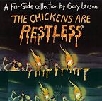
Gary Larson, The Chickens are Restless. This cartoon, The Far Side, used to appear in The Press and Journal, which was my local newspaper in Aberdeen, Scotland. So as a child I’d see this every week. They had Hagar the Horrible too. I used to cut out Hagar and Garfield and this. The Far Side was definitely my favourite. Well, maybe Garfield was my favourite for a while, but we’ll gloss over that. The Far Side is the working of a really strange mind. What really appeals to me about this cartoon – and you get it with all the people I’ve chosen, but particularly I think with Larson – is the way you go back into his world each time. Which means that something you might not have found funny when you weren’t acquainted with that world becomes funny simply because it’s on The Far Side. He needs to do less and less to be interesting. You’re just so happy to go back to meet these insects and cows in business suits.
Do you like his drawing?
It’s not that attractive. He draws buildings in a nice simple way, but his people are horrible and his animals are pretty ugly. I do like nice drawing, but if the rest of it’s good enough you can accept it. Anyhow, everything, even the ugliness, lets you know where you’ve come back to.
Which is your favourite one?
I’m trying to think. There are so many good ones. The dark, weird, subtle ones.
Your next book, I think, is by Edward Gorey, who’s perhaps the most beautiful draughtsman on your list.
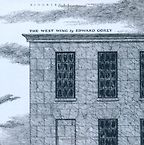
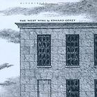
Yeah, they’re a sort of perfect contrast aren’t they? The book by Gorey I’ve chosen is The West Wing, which I first saw when I was at college in Edinburgh. And it was amazing. It was a real revelation. They were obviously picture books for adults, they were obviously not comics. And I didn’t know anything about them. They were just so unusual. I mean, once you really think about them it becomes obvious they were done in the 20th century, but they look so old fashioned – they’re set in a pre-20th century, or at least pre-war context, even though they were drawn in the 60s onwards. They’re funny but dark. Everything about them was different from what I’d expected. They weren’t ugly like most comics – even a lot of great comics are ugly, or at least very graphic or bold, very crudely drawn. Whereas Gorey’s drawings are incredibly subtle. I know more of his stuff now, but this was in 1996, and he was out of print in Britain then. They just seemed amazing to me. Look at the design of that cover. He did his own lettering, so beautifully and carefully.
He’s fascinated by aristocracy isn’t he? The gothic aristocratic ghoulish thing.
Yes. I like the atmosphere of them. I like the packaging. The sense of humour appeals to me as well. This book’s called The West Wing and there are, what, 30 pictures just wandering around a building: pictures of ghosts and mummies and a corpse and a box and various other things. It’s very like my work. It could be slight or boring, but he puts just enough in to intrigue you, to give the atmosphere. You want to make up stories. He’s guiding you towards a feeling.
You haven’t chosen any title that’s just a straightforward comic you’d throw yourself on the sofa with.
Well, the next one, Chris Ware’s Acme Novelty Library – this issue is almost wholly one story. But no, I think I’m probably more interested in the weird, unusual storytelling method. Which is maybe why I’m having such trouble trying to write a graphic novel at the moment.
Let’s talk about Ware’s most famous creation, Jimmy Corrigan.
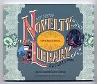
This issue was before his graphic novel [Jimmy Corrigan, the Smartest Kid on Earth] was released, when Jimmy Corrigan was coming out in episodes. Chris Ware had this thing called the Acme Novelty Library, and the issue I’ve chosen is no 13 in the series. I’ve been buying it since no 4, and originally he was just telling short stories and including cut-out models and drawings. Like the Gorey books it was a comic but it was beautifully produced, and he’s interested in – sometimes ridiculously interested in – design.
What qualities do you like in the story?
It’s a short story about Jimmy Corrigan senior – Jimmy’s grandfather – at the World Fair. I think it’s my favourite. I chose it because it stands particularly well on its own. Ware’s very much into the interaction of words and images. He has narration and speech and thought bubbles and he’s really interested in how these two ways of storytelling work together. And he’s really into the division of space on the page. The flatness of his drawing makes that division easier, and he’s a master of atmosphere with colour. But it’s depressing. It’s a very bleak story. He does write in some positive stuff, but it’s almost bleaker than I can stand. I could never be so mean to my characters. I’d kill them, but I couldn’t make them so hopeless.
Do you think Chris Ware could hijack Garfield for a week?
Well they’ve done some interesting stuff with Garfield, like cutting out everything Garfield says and just having Jon, his owner, talk to him like he’s a real cat and Jon is insane. And then someone just took out Garfield altogether. You can do a lot of that deconstructive stuff with Garfield because it’s so formal and simple. How tragic the cartoon seems if Garfield’s not saying anything!
Last one.
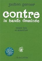
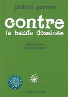
Jochen Gerner: Contre La Bande Dessinée is not so much a comic as a collection of words and images. I think he’s interesting. His language is beautifully pared down, and it seems there’s nothing he can’t draw in this lovely, simple style he has. Jochen Gerner is French and my French is terrible, but basically what it is is a joke study of comics, a satire of a very academic view of comics and graphic novels. It’s a series of strange visual essays about the various aspects of comics and they’re very playful and silly. I like the simplicity, the beautiful graphics, and the absurd systematic quality he brings to things, like a page in which he lists all sound effects available to a writer of comics. Three pages in fact and they’re French sound effects, which are different to ours. It’s just funny. In a way he’s taken it seriously. He’s given them numbers and that just makes it funnier. I’m very proud I appear in one of his lists.
January 23, 2010. Updated: July 4, 2021
Five Books aims to keep its book recommendations and interviews up to date. If you are the interviewee and would like to update your choice of books (or even just what you say about them) please email us at [email protected]
Five Books interviews are expensive to produce. If you've enjoyed this interview, please support us by donating a small amount.
