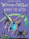
You’ve been illustrating Winnie the Witch for 30 years. It’s such a successful series.
Yes, 30 years and when I handed in my most recent drawings, for the first time in 30 years, the team at OUP rejected one of my drawings! They were right. It was a good drawing but it wasn’t of a castle. It was a kind of Tuscan manor. My editor and designer, they were very nervous to tell me, but they were absolutely right.
Things have changed over the last 30 years. The new TV series has meant a re-brand and they called it Winnie and Wilbur as Wilbur has been such a popular character. But covers have to be strong these days—cover design now has to be visible as a thumbnail on the internet—we have to take this into account and design accordingly.
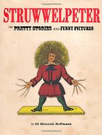
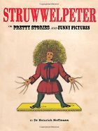
You first book is Struwwelpeter (1845) by Heinrich Hoffmann.
When I was a kid we had this book and I loved it. It’s pretty scary but what I loved were the drawings, the lay-outs, quite simple line work and flat colour. I think it was just the nature of how they printed in those days. That image: the hair and the long finger nails—and the clothing! I mean when I’m sitting in Africa in shorts and t-shirts and here is Struwwelpeter dressed in wool and so many layers. All this amazing clothing that people wore in 19th century Germany—all those funny little hats! Also, look at the stories, “The Dreadful Story of Harriet and the Matches”—this fantastic picture of Harriet on fire! In the end she is reduced to a little pile of ashes—and her little cats all crying tears—it’s brilliant. Then “The Story of the Inky Boys” and how it tackles racism—and this picture of their teacher, Agrippa, and his huge inkpot and amazing hat.
“Look at “The Dreadful Story of Harriet and the Matches.” In the end she is reduced to a little pile of ashes—and her little cats all crying tears—it’s brilliant. ”
My grandmother was an illustrator and painter who had huge inkpots—she was my influence. She had a farm up in the Kalahari. There were all these wild animals. She painted everything she saw—bushmen, animals, the birdlife, the countryside—these huge communal nests of African swallows built in the trees. Her pen and ink work was a great influence on me.
And being with someone who was always drawing and observing–did that get under your skin?
Yes. And she was really encouraging. When she got too old to paint she gave me all her equipment. I’ve still got a lot of it. This book, Struwwelpeter, has always been a great influence on me–the eccentricities of it! These pictures really stuck in my mind. To her credit, my mother didn’t censor it at all.
I read that Hoffmann went shopping for a book for his own children, back in the 1800s, and couldn’t find anything he liked so he wrote this one. And its irreverence and tendency to violence have been an inspiration to children’s writers ever since—from Hilaire Belloc and Roald Dahl and onwards.
Is that true? It’s also been so well translated. Whoever has done this has really captured the English idiom. And “The Story of Fidgety Philip”–we had friends who were like this and kids who were thumb-suckers.
We used to play with fire. We made little fires called ‘braai’, it was so dangerous to do this out in the Veldt.
It always fascinates me to hear how an illustrator chooses what to illustrate. How to tell the story. You have the text so how do you decide what to show and what to leave to the reader’s imagination?
That’s the hard bit. Sometimes, you see, there can be a lot happening. It can be difficult to decide.
Struwwelpeter was the book I most remember from my childhood. But there were others: Jock of the Bushveld–it’s a really odd story, and another called Soul of the White Ant by Eugene Marais. This guy was a scientist, an entomologist so the story is based on fact.
I think a basis of fact can be very reassuring for children. I think they recognise a layer of truth—or the fact that there is truth lends the story a layer of authenticity.
I’ve been caught out with facts before. In one of the Winnie books she waves her wand and goes back in history to the time of the dinosaurs. I read this book at a school and a little boy put his hand up and said, “You’ve made a mistake!” and I said to him, “What do you mean? Illustrators don’t make mistakes!” In my jungle, I’d drawn trees with creepers. The boy explained that there were only ferns in the time of the dinosaurs and that I ought to go and correct it.
Isn’t that great? I just drew the dinosaurs in a jungle. But I had it wrong. Wrong trees!
Another time another kid pointed out that I’d got something wrong in space. Children are pretty exacting readers as well as critics.
“My mother encouraged us to read–she didn’t care what we read–so we were allowed masses of comics.”
My mother encouraged us to read–she didn’t care what we read–so we were allowed masses of comics. I read a lot of Marvel and DC Comics. She also took us to the library every two weeks. Which maybe counteracted it a little–some people frowned on her letting us read comics.
I loved The Hardy Boys and their incredible adventures, I read a lot of Enid Blyton but they didn’t make much of an impression. Oh, I did like the Just William books–the society seemed so formal to us, where we grew up it was pretty informal, we were running around in bare feet. So we had an interesting perspective on English society through these library books.
Get the weekly Five Books newsletter
I went to art school, studying fine art. I did a course in illustration because I was trying to work out how to make a living as an artist. We had some fantastic teachers, it was a very classical education–figure drawing, for instance, we had to draw the skeleton from memory. They’d give you a bit of bone and you’d have to draw it and add the muscle. Light and shade, chiaroscuro, perspective, everything. It was an amazing course. Not so much conceptual art or videos in those days!
We had a guy called Mr Barry Mauritz, he would ask us to bring in interesting objects to draw. We’d draw them from one angle and then he’d make us get up and make us draw it again from a different angle. He liked bits of car engines, or scientific equipment, or tools–something weird. And, once we had drawn it, he’d take it away and make us draw from memory.
“What I love most about all the books I’ve chosen, or all the artists, is their sense of design and their view of a scene – how they visualise it. ”
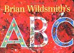
Anyway–one day someone turns up at school with a Brian Wildsmith book. I think it was the ABC book.
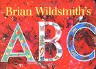
Yes, the ABC (1995) was the first book Brian Wildsmith illustrated for OUP. And it won so many prizes.
I was just blown away by it. The design, the colours. The colours were so vibrant. I hadn’t seen anything like it before. So, then I started looking for his books. He was a great inspiration to me. He is a wonderful draughtsman… but also the layout and the design of these books is fantastic–the animals can be almost abstract yet perfectly observed. Contrasts of green backgrounds, fine texture, the bright white that leaps out at you. Detail and colour. Confident lines. I mean it is extraordinarily good work.
“The European comic artists have a different style–they don’t use the thick line of the Americans–they use a finer line.”
Then I came to Europe and I came to Antwerp. I did a grand tour of all the great art galleries of Europe. I had a camper van. I wanted to see all this work that I’d studied. In Antwerp I was wandering around and I stumbled across this street of bookshops. I’d never heard of European comics and there were all these French and Flemish comics.
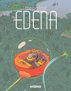
And this was when I discovered Mœbius and his dark stories.
I found out that comic artists use brushes–not pens–to paint their work. This was a revelation of sorts to me. Chris Riddell is a great master of the fine brush. The European comic artists have a different style–they don’t use the thick line of the Americans–they use a finer line. It’s such a different style of drawing that you just didn’t see in the American comics. And a slight weirdness. The layouts are distinctive too. The colours are subtle and very expressive–pinks, purples and browns. The different comic book artists also have very individually distinctive styles–some are scribbly and relaxed, others more formalised, some make use of cross-hatching.
But Mœbius has such an imagination–lovely line work. He has the same sort of imagination as Philip Pullman–or writers like this. The storytelling with the pictures is so compelling.
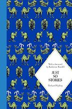
We should look at the Just So Stories (1902) by Kipling.
I love these stories and the way Kipling addresses the reader as ‘Best Beloved.’ It’s so charming. His pen and ink work is superb. The way he drew is quite beautiful. Really fantastic. The lay-out again is wonderful to look at. He has such simple backgrounds and then all this incredible detail. I love the one about the butterfly who stamped. Again, he really uses contrast to great effect. His cross-hatching is lovely. The way he frames each illustration and how it is positioned on the page.
There is a super quote from the introduction, by Katherine Rundell, of this edition, she says that Kipling carried “his imagination like a knife in his shoe–it could flash out at any moment”.
I’m not much of a literary person. I like the pictures! I love the stories but, for me, it’s always the pictures first. That’s why I like comics and Mœbius so much.
Which makes me want to talk about my next choice–Sempé. I met this guy once. I first stumbled across him when I was living in Athens and I bought a Greek copy of Echo Des Savanes to learn Greek. In that there is a great spread full of lots of people marching, some kind of freedom or protest march, and everyone is carrying banners proclaiming freedom this and freedom that. Then one little guy has ‘Rooms to Rent’ on his banner! Haha!
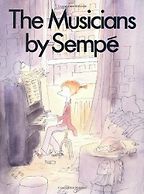
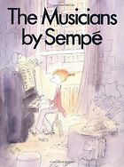
And it was this beautiful drawing, simple line work and so much detail. And funny. I also discovered him through his illustrations for the New Yorker. He did so many covers for them. The book I’ve chosen is The Musicians (1987). Such a unique style, so carefully observed and softly drawn. The variety, as well, is unexpected. Clearly observed, loosely drawn trees but accurate. The story telling draws the eye and he knows just what to leave out. This allows our brain to fill it in. His design and layout play with scale to great comic effect. A great sense of perspective. It looks so effortless but many of these spreads are very complicated and difficult to achieve.
“I love the stories but, for me, it’s always the pictures first”
My French publisher, when I had one, took me to a Sempé book signing. So my copy is signed. I asked him if he planned things out, did he make a plan for each illustration? He said, “No, I just start drawing!”
How do you do that? I can’t imagine that. I plan everything, I do roughs. I stick it on the light box and trace it out.
But Sempé said he just starts and if he doesn’t like it he just starts again. Amazing. He captures those hilarious little domestic moments.
What I love most about all the books I’ve chosen, or all the artists, is their sense of design and their view of a scene. They all have such a wonderful way of visualising a scene—do you view it from the top or the bottom? What do you include in that scene? This is the really important stuff when you are illustrating. With Brian Wildsmith it’s the colourwork and the draughtsmanship that really appealed to me. Sempé—it’s the line work and his view of things, how he played around with perspective and how he played with scale—great big rooms and little people. Also the way he chooses to exaggerate things. None of the artists I’ve chosen do photographic representations of the world. They have their own way of leaving things out or playing around with the landscape. The perspective may not be right, but they can still make it work and make it say something specific.
I’m so aware of the way things sit on a page–the cut off, the “bleed”, do you choose to make it big or small. This all came from working in advertising–doing layouts and design of press advertising and packaging. Typography for me is also really important.
I love detail. The author doesn’t have to describe everything. Sometimes authors get a bit carried away and I’ll say, “Look you don’t need all that. I’ll draw it–tell me that it’s a castle and I’ll draw you a castle. Give me some key information and I’ll include that if it is key to the story.”
I’ve always thought that as an illustrator you would have to form a connection to a piece of writing. Is that true?
Yes, absolutely.
I discovered later that three other artists had tried to illustrate the Winnie the Witch story and they had all done Winnie’s black house as a silhouette. Now when I had a go, because of my fine art training, I’d been taught that if you wanted a warm black add red and if you want a colder black add blue. Because black can be such a dead colour–it can be a bit flat–but adding red and blue in this way you can add something to it. So this is how I did Winnie’s house and that is what they loved. I also thought that with a black house you need colour somewhere so I made her clothing very colourful–especially her socks. I don’t know where they came from but I gave her red and yellow stripy socks. It just kind of gelled for me. Also Ron, my editor, gave me the confidence by simply saying, “Yes, go off and do it.” No other instructions–just get on with it.
Interview by Zoe Greaves
June 7, 2017. Updated: April 27, 2023
Five Books aims to keep its book recommendations and interviews up to date. If you are the interviewee and would like to update your choice of books (or even just what you say about them) please email us at [email protected]
Five Books interviews are expensive to produce. If you've enjoyed this interview, please support us by donating a small amount.

