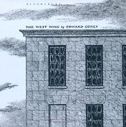
The West Wing
by Edward Gorey
Look at the design of that cover. Gorey did his own lettering, so beautifully and carefully. The sense of humour appeals to me as well. There are, what, 30 pictures just wandering around a building: pictures of ghosts and mummies and a corpse and a box and various other things. He puts just enough in to intrigue you, to give the atmosphere.
Recommendations from our site
“Gorey’s drawings are incredibly subtle … Look at the design of that cover. He did his own lettering, so beautifully and carefully.” Read more...
Tom Gauld, Cartoonists & Illustrator


